Process : Feature Fireplace
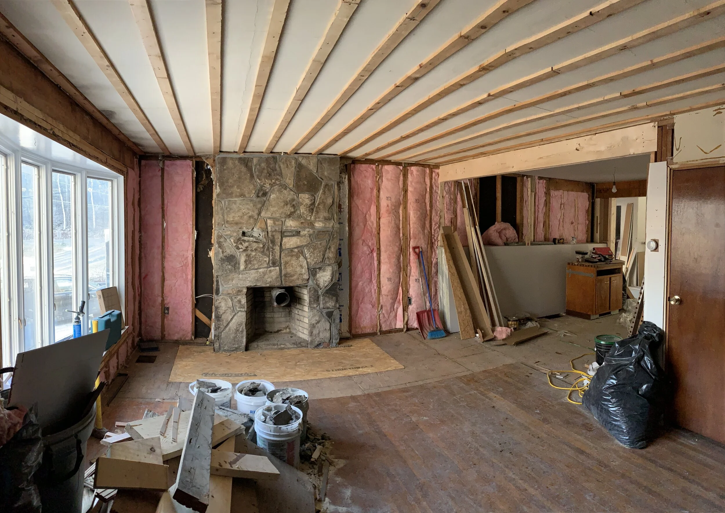
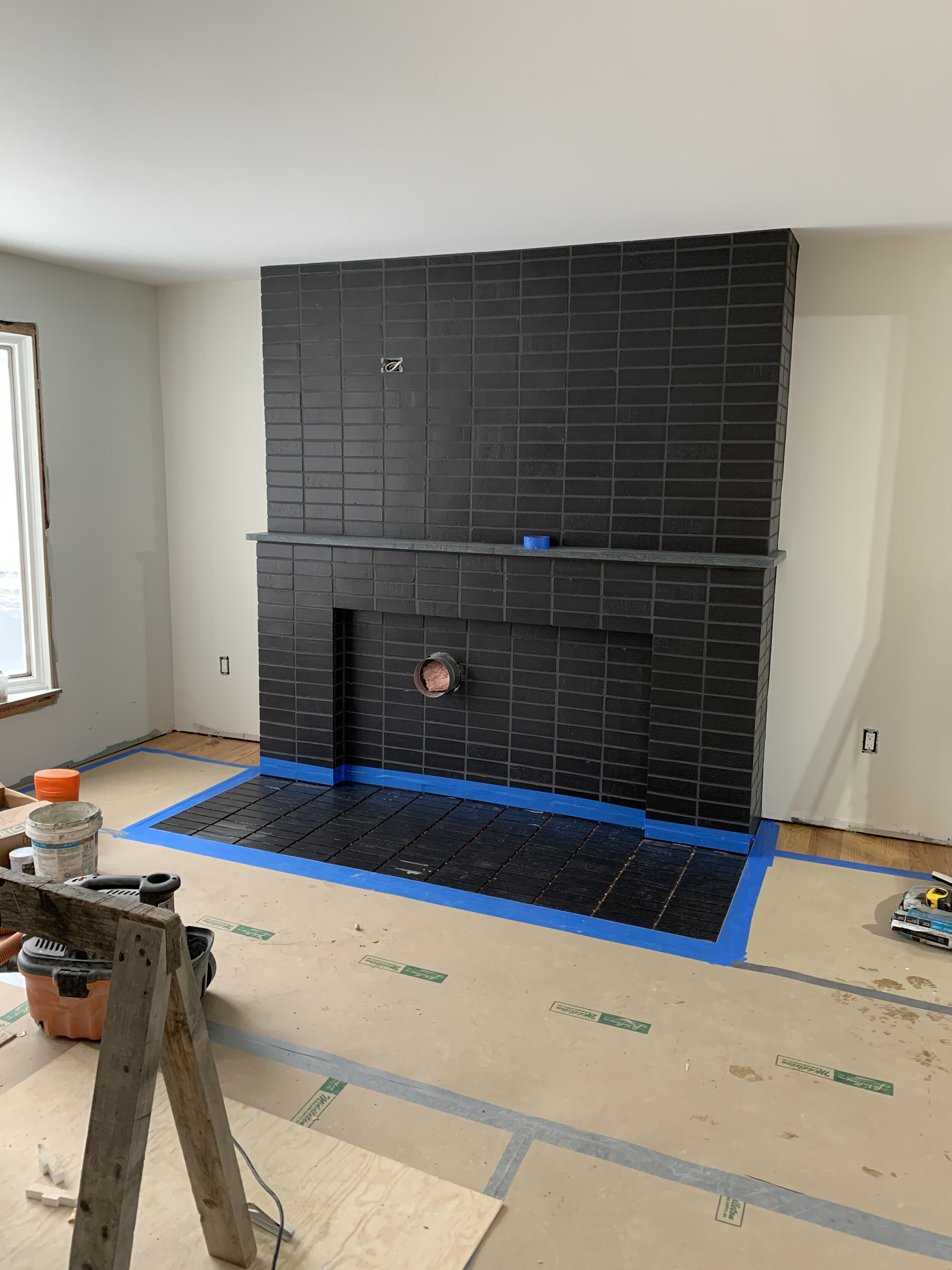
Midway through the buildout of this kitchen/mudroom/garage addition, my client asked for ideas to improve his existing fireplace. I couldn’t have been more thrilled to add this piece to the project. The existing design shown below was a large format rock veneer stone with a hearth that was made for toe stubbing.


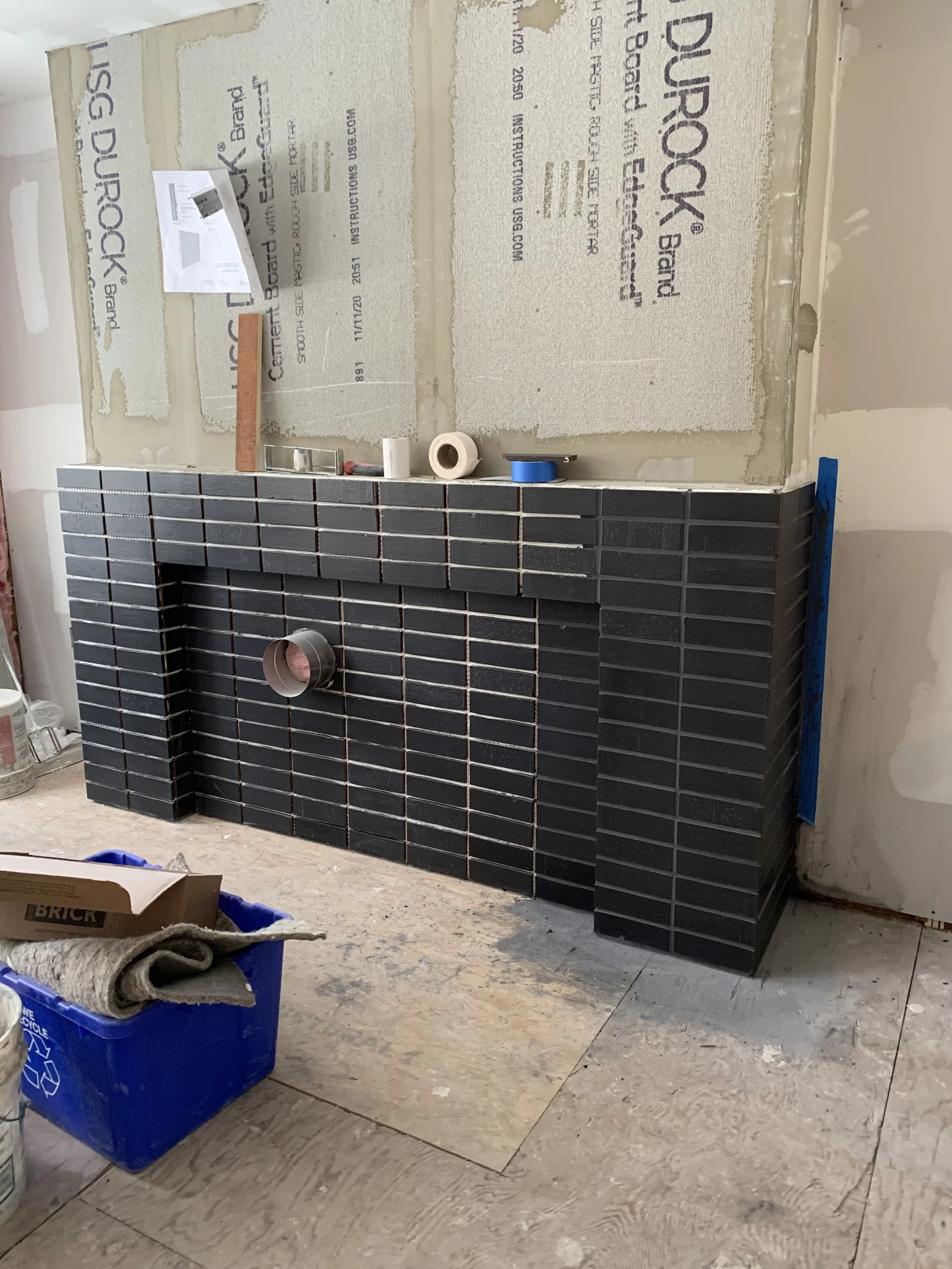
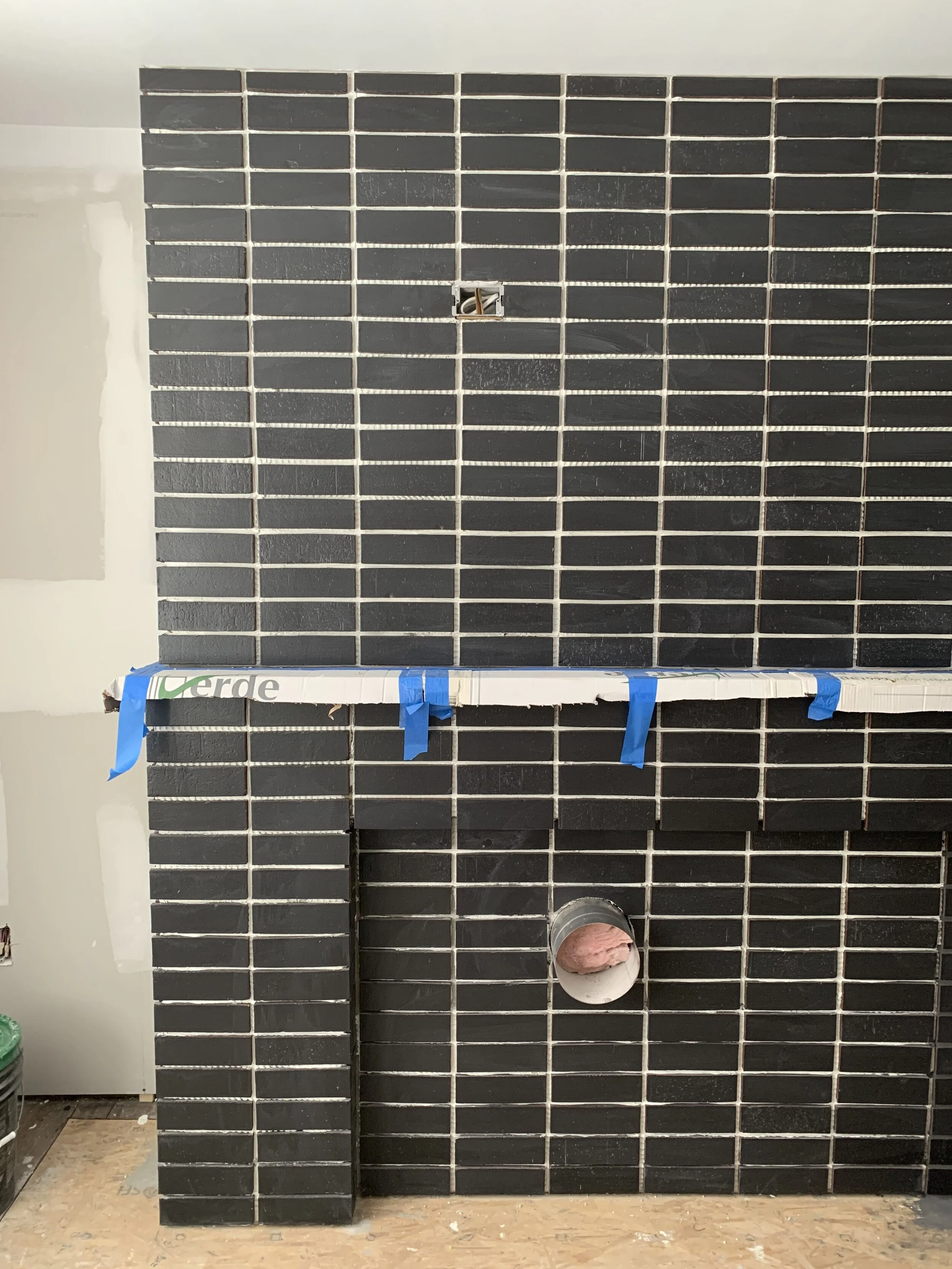
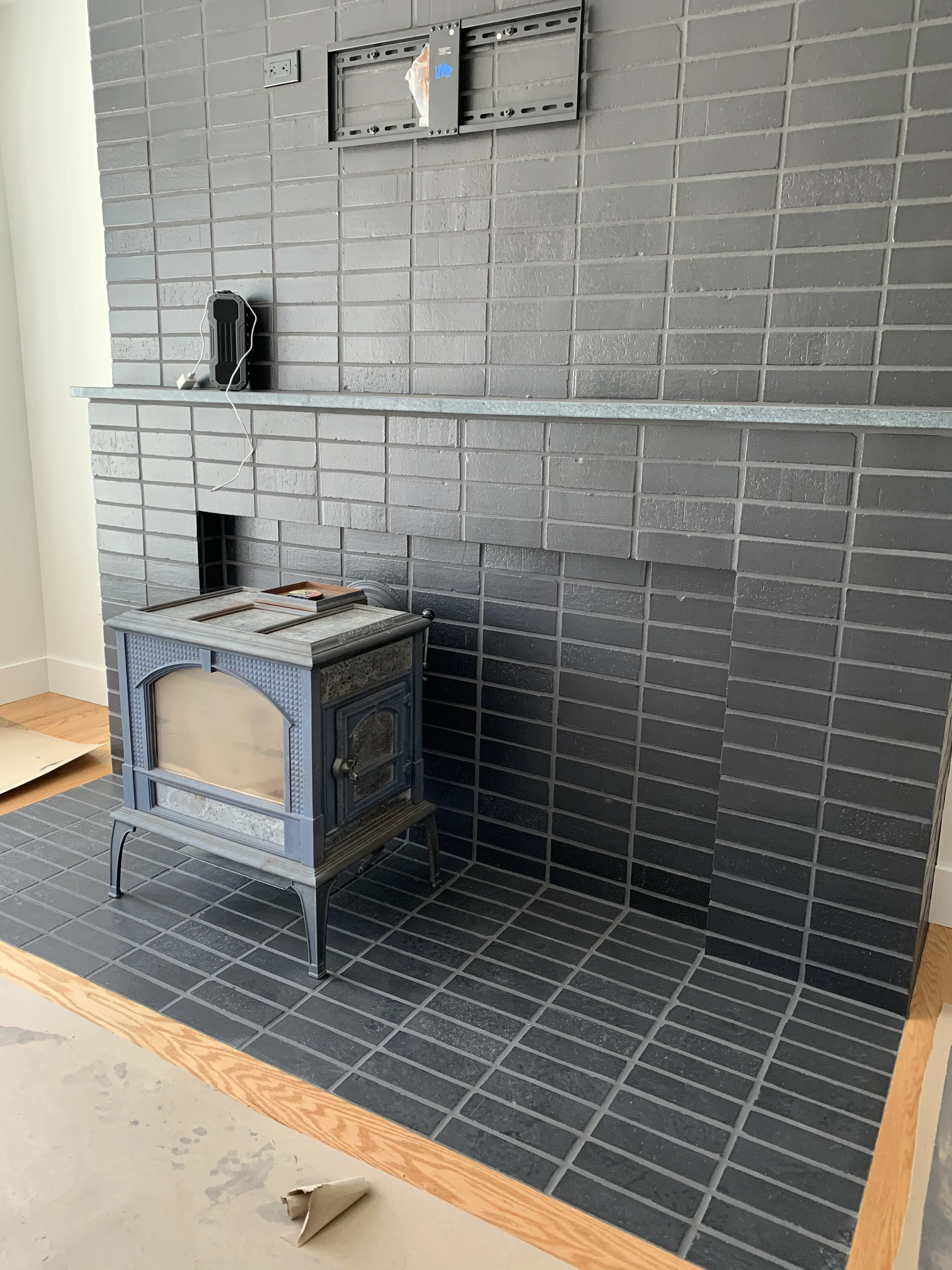
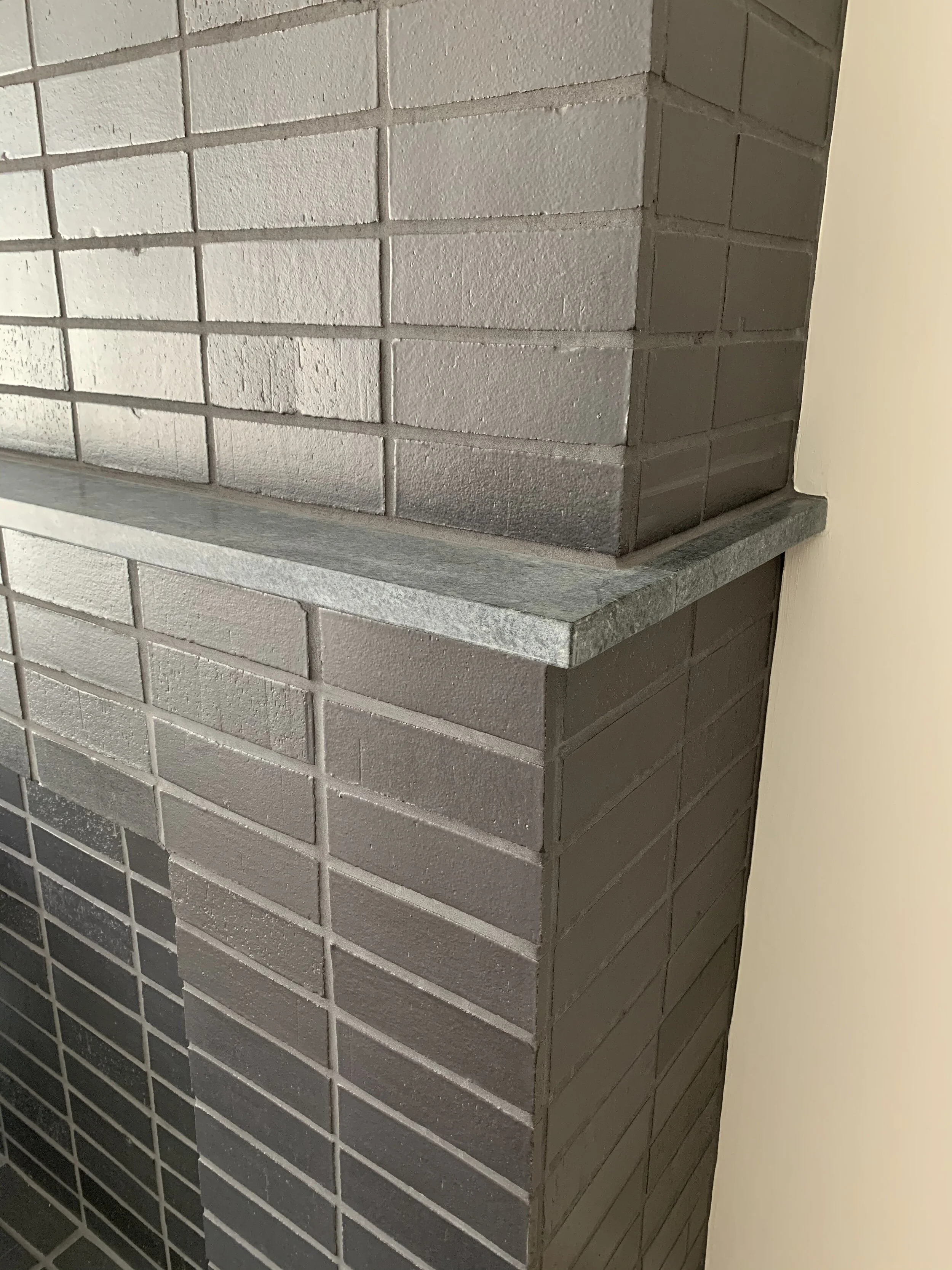
I proposed building out around the existing fireplace to avoid additional demo work. This was possible because my client intended to keep using his wood stove in place of an actual wood burning fire, so we only had to worry about the proper venting of the stove. A shallow reveal behind the stove gives the impression of a firebox while allowing us to leave the existing materials in place. The hearth was removed and replaced with one that was flush with the new living room flooring and made out of the same thin set brick material as the rest of the new fireplace. A soapstone ledge gives the TV above additional protection from the heat of the stove, and the whole piece is centered on the living room wall…symmetry at last! I proposed a black handmade brick material so the large TV blends into the wall when it’s turned off. It was my hope that the TV would take a back seat and your focus would be the beautiful variation of the bricks.


IMG_4937.jpeg
 

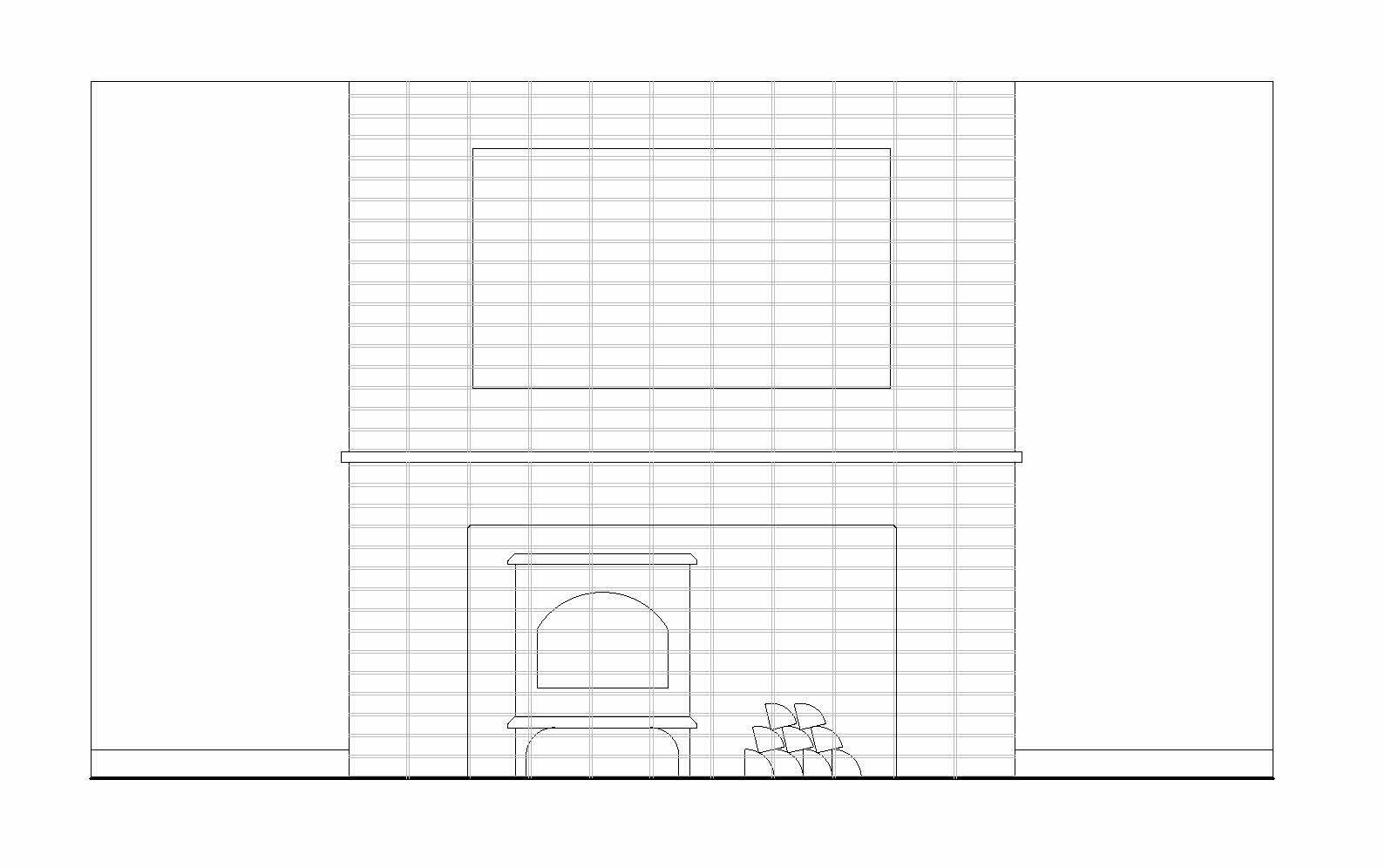
And the final reveal…

RYAN BENT PHOTOGRAPHY

RYAN BENT PHOTOGRAPHY

Color Theory : Painting Plan

One of the most important jobs of a designer is translating our ideas into drawings that clearly show how to build out and finish a space. Even the most simple projects can benefit from an instruction sheet. I put together this little diagram for the Westborough House to show the painter the scope of the project and color selections for each room. A drawing like this is especially beneficial for an open plan home where there may be questions about where to start and stop different paint colors, or in identifying the location of accent walls. I’ve used a drawing like this a couple of times now and it’s been a great resource for both the painter and the client!

Color Theory : Westborough House

A few months ago, I helped my sister with some paint selections for her new house. The idea was to keep it light and clean with gray tones throughout the entire space. I arrived armed with a pile of samples and some sketch paper and we got to work. In my opinion, it is imperative that you look at paint samples in the actual room you’re choosing them for. The color you see on the wall is affected by many variables including the amount of light in the space and the orientation of the surface. I like to leave the biggest samples I can find in the rooms and encourage my clients to live with it for a week or so before making a decision.


Our strategy here was to use a cool, gray toned white upon entering the house through the kitchen and draw your eye toward the back with a slightly darker shade. We selected a hint of green for the bathroom and a hint of blue for the master bedroom. Very subtle. All of the trim was refreshed with a bright semi-gloss white and the hardwood floors refinished with a natural stain. Pictures of the finished product below, all credit for decor goes to my sister, she has great style!